 Photorealism - Drawing What We See Photorealism - Drawing What We See
This tutorial began as work for PS Elements 2: Most Wanted (Friends of ED, 12/02). Since this part ended up on the cutting-room floor (page limits... your Goddess always goes on too long!), I am publishing this here instead.
This piece was written using Elements, but everything we do here can be done with full-version Photoshop. The screenshots will be slightly different in places.
If you find yourself wanting to learn more about Photorealistic Painting in Photoshop, I have a six-week online class in just this subject! You'll make several paintings and learn many cool techniques for making real paintings that look like photos! Learn more about my classes...
|

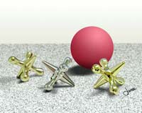
Drawing
|
| Trapped within many of us who play with photos is an artist who wants to be able to draw. Many of us have thought that we couldn't draw and so we have resorted to trying to make our photos look like drawings or paintings.
It is for us that I wrote this. Much of what we will do here involves learning to see, and not just learning the tools of Elements, but I want you to have this. I will include enough cool tips here that I hope we can get this past the editors. (I didn't!)
|
The American Heritage Dictionary (Houghton Mifflin Co.) defines photorealism as "A style of painting that resembles photography in its meticulous attention to realistic detail."
Photoshop Elements has some wonderful tools which can help to make us better photorealistic artists, but the tool we most need is our eyes!
|
|
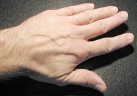
We become accustomed to seeing things with our minds. We see a photo of a hand, and our mind tells us that this is a person, and probably even tells us the gender and age of the person. In photorealistic painting, we have to step down a little, and stop trying to read meaning into what we see. In order to paint what we see, we have to train ourselves to see, not "a hand." Instead, we need to learn to see the lines, shapes, colors, shadings, and highlights that make us think that we are seeing a hand.
|
 |
| Whereas many styles of art call upon the artist to paint a mood or an emotion, photorealism calls for us to paint ONLY what we see. This does not mean that we are trying to paint a 3D object when that is what we see. We actually have to learn to look at things in 2D, in order that we may paint them in 2D .. so that they look 3D! We have to learn to look at the world as if it were all pixels.
|
Tip: Do everything new on a new layer. This gives you the most flexibility. If you halfway like what you painted, for example, you can reduce the layer's opacity to 50%!
|
| I don’t know how “real” artists learn to paint what they see. I know how I am teaching myself to paint what I see, and much of what I have learned has been from painting whilst looking at a photo. When you look at a photo, zoomed in very closely, it is evident that you are looking at pixels.
|
Tip: Save. When you first begin your project, File -> Save As... and save your file in psd format. Then when you do subsequent saves, it will save to psd format, retaining your layers, and not losing any of your image data, as you would if you were saving in jpg.
Ctrl-S to Save OFTEN. It's easy, it's fun, and there will be a time when you are glad you did. If you don't remember the last time you saved, it was too long ago.
|
|
So your job is to reproduce that set of pixels. Of course, in a detailed photo, there are many pixels in various colors, some clumped together, others scattered about. No one is saying that this is easy. I do maintain, though, that it is very gratifying to look at something that you painted and see that it looks quite real.
|
| Elements has many cool ways to help you in laying out pixels into a digital painting. Suppose you want to recreate this photo of jacks, as a painting.
Approaching this in the usual manner, you may sketch out the jacks and the ball against this plain background. You would then wonder, “How do I get that gold to look gold?”
|
Indeed! I get email daily from people asking “what color is gold?” “how do I make something into chrome?” or lamenting that “this gold looks like yellow plastic!” It is my hope that you come up with an answer for this here.
|
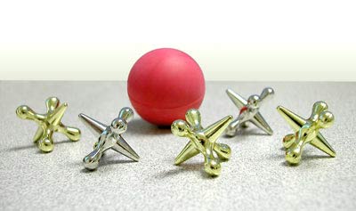 Photo Photo
|
Roughing it out. Before we get into the details, though, let’s begin at the macro level.
- With your photo file open, make a new file for your painting. Be sure to make it as large as practical and 300 ppi. So you now have the photo file and your painting file, both open on the desktop.
|
Tip: To erase a layer fast, try this: Ctrl-A (Select all), Delete, Ctrl-D (deselect).
|
- On a new layer in the painting file, color in the general shapes of your objects, using different layers for each. For this example, you can paint the floor and the wall by filling rectangular selections. The wall is a slight gradient. For now, just do the floor as solid gray.
- Filling a circular selection with red will take care of the ball.
|
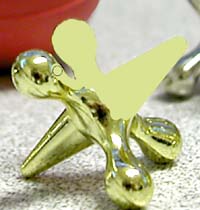 |
| For more complicated shapes, like these jacks, you may want to work in the photo file, tracing them onto a layer right above the photo layer. Type I for the “I”-dropper ;) and choose a color from each of the jacks, one that seems predominant. Then, on separate layers, grab a hard round brush, and color over each of the jacks in turn. On another layer in the photo file, sketch shadows, too. |
 |
| Then drag these layers with your tracings over to the painting file. Label the jacks base layers “Jack 1 Base, etc.”
Next, make a new layer, labeled “Jacks detail.” Paint the main details for the jacks. This is where you really have to look at the pixels and not at the object. (Here is where you zoom in and answer for yourself, “What color is gold?”)
(When you zoom in to the first jack, it is clear that this jack is not in focus. In my drawing, I can make mine focused, though, and I choose to do that.)
I began by first painting the very light and the very dark reflections.
As you work, sample the colors from the photo and then use them on your painting. Use as many layers as you want for this part. Sometimes I’ll make a new layer whenever I start with a different color or start something different.
|
 |
Tip: Sample-painting is done by grabbing, or sampling, color from one part of an image, and painting with that color onto another part or another image. It is much like cloning, except that you use the paintbrush, and you are only grabbing the color at the point where you are sampling.
- Sample the color by holding Alt and clicking your brush.
- Then release Alt, and paint. When you are doing sample-painting, your finger will remain close to the Alt key.
|
Tip: Setting the accuracy of your brush sampling. The accuracy of your brush sampling depends upon, of all things, how your Eyedropper options are set:
- Type letter I (for I-dropper) and check in the options at the top.
- For sample-painting, you should have Point Sample selected. In the other settings, Elements will take an average color for the pixels surrounding where you click. This might work fine for some things, but if you are doing precision painting, you need the precision of point sampling.
|
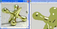
| With the photo and the painting files next to each other, and each of them blown up considerably, copy the shapes and colors of the various reflections that are in the photo onto the painting.
As you do this, it may seem mechanical. The first jack I did, as I was painting, looked like unrelated blobs of paint, and it didn’t feel as if I were getting anywhere. (What color IS gold? What is it that makes us think that we are seeing gold and not just yellow plastic?)
|
Put the painting and the photo close together and copy the details from the photo onto the painting.
|
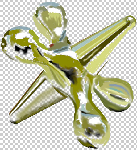
This is what the highlight painting looks like on the 3rd jack, with the visibility for the jacks' tracing layer turned off
|
| Then as I finished the paint on that first jack, I zoomed out. I'm sure you have heard the expression, "Watch your pennies and the dollars will take care of themselves." Well, if you watch your pixels, the painting will take care of itself!
Whilst this looked like meaningless paint blobs up close, zooming out brings reality!
|
Tip: To paint a perfectly straight line, click your brush where you want the line to begin. Hold Shift and click again at the end. This works for erasing, too! For this example, I used this tip a good bit whilst doing the pointed ends of each of the jacks.
|
|
|
|
Highlights for the third jack:
|
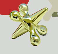
The details of the third jack:
|
| So if we paint what we SEE, not what we think we SHOULD see, we will end up with something that looks real. We have to teach our eyes to fool our brains!
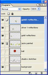
As you are doing a project like this, DO use layers. Add more by clicking that Create a New Layer icon at the bottom of the Layers palette. The more the merrier with layers.
|
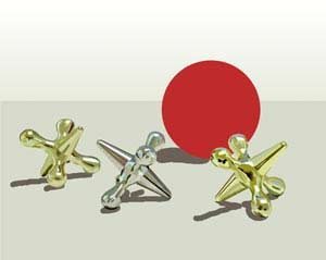
All three jacks painted:
|
| Tip: Labeling your layers will help you to keep track of them. To rename a layer, double-click its name in the Layers palette and type in the new name.
|
 |
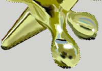
Tip: Trimming away sloppy painting. If you have made a careful base layer (where you colored the jacks to start with, and then put details on another layer above it, you can use this base layer to trim away stray details. Here’s how:
- Ctrl-click on the base layer. In the case of these jacks, it was the “jacks painted” layer, where I had painted blobs of paint to cover the jacks at the outset. This makes the selection ants run around the perimeter of where the jacks’ outline should be.
- Ctrl-Shift-I to Invert the selection.
- Click on the details layer. (reflections, in this example)
- Click the Delete key on the keyboard. Trimmed!
- Ctrl-D to Deselect.
|
(selection for trimming)
|
Tip: To set both Foreground and Background colors, here's a shortcut.
- Type I to bring up the “I”-dropper.
- Click it on your image where you want to sample the color.
- Type X to eXchange fore and background colors.
- Click it on your image to sample the color.
- Type X again if you need to eXchange colors again.
|
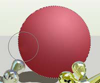
For the ball, I didn’t want so much realism. In particular, I didn’t want that equator ring around it, but instead wanted a smooth rubber ball. I also want very smooth gradations of color, which tells me, “Gradient!” I see this red as mostly a light red to dark red gradient, but centered upon the upper central right, where it is the lightest. Here are the steps that I used in painting my ball:
- In the photo, sample the lightest part of the ball for the Foreground color.
|
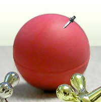 |
- Sample the darkest part of the ball for the Background color.
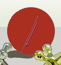
- Type G to bring up your Gradient tool and options.
|
 |
- Choose the Radial Gradient, and be sure that Foreground to Background gradient is chosen.
- Make a circular selection for your ball on the painting.
- Make a new layer.
|
 |
| The bottom of the ball needs to have a bit more shading. Make a new layer. Choose a wide brush with a low opacity and black.
Run the brush along the bottom edge as here at the right.
|
 |
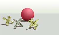
| For the floor, use whatever texture you want. I used a granite texture which I made as follows:
In a new file, which is larger than your painting where you want it, drag a dark gray to white gradient from the top to the bottom.
Noise -> Add Noise .. and give it just enough noise that you can still see that you have a color gradient.
Filter -> Pixelate -> Crystallize… Your cell size depends only upon how big you want it.
|
 |
|
Now it is important to have the floor in proper perspective, or it won't look right. The grains in the back will be as big as the grains in the front. They are not that way in real life, to be sure!
- Drag your floor onto your painting document.
- Ctrl-T to bring up the Free Transform bounding box.
- If your bounding box is not fully visible, Ctrl-0 (zero) will make it so.
- Hold Ctrl so that you can freely distort the corners.
|

|
|
| Shadows.
Now we have to make sensible shadows. I found the shadows to be the most difficult part of this project. Where they interacted with the surface upon which they sat played havoc with my usual sample-painting technique, so I resorted, ultimately, to doing them differently.
|
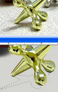
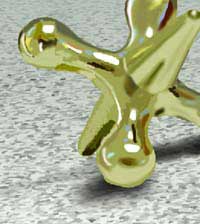
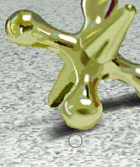
Photo (top) and my drawing (below it) as i sketch out the shadow with the lasso.
|
|
Shadows are very important, because they determine for your viewer the location and strength of the light source. If the shadows and the lighting on the object itself are ambiguous, it is confusing. Something is just not right about the painting, and often it is difficult to see what it is.
|
 |
|
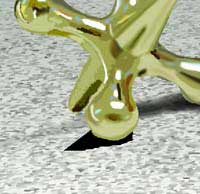
Shadows also are what gives weight to your subject, anchoring it to the surface, instead of leaving it floating above it. Shadows will be darker where they touch the bottom of the object, and will fade gradually as they get further away.
|
 |
|
I did each of these objects' shadows in several layers. For the darker parts of shadow, I used one layer. Medium intensity used a second, and the delicate breaths of shadow were on a third.
|
 |
|
For each part of the shadow, I began by making a selection and filling it with black. I blurred this, and then duplicated it, if necessary, trimming or reblurring, as needed. This is clearly where science meets art. And this is also clearly a place where we have trouble seeing, because we are not accustomed to paying particular attention to shadows when we look at things.
|
 |
|
|
I said at the outset of this project that we most need our eyes for this kind of art. We actually need three things:
- Careful observation of your world.
Whichever of these is weakest in you points to where you need to focus your attention today. Saying “I can’t” ... won’t help.
|
In this tutorial, I did not intend to give you “recipes” for effects so that you can do these exact things in these exact way. It is my hope, instead, that I have given you some ideas and inspirations. Your muse will lead you to your own creations from here!
|
|
I hope you enjoyed this tutorial!

|
My student Angel painted her cat in Photoshop using her photo and techniques that she learned from this tutorial.

|
Angel tells how she did this:
While I didn't visit the tut for reference while I was working on Yoda, I did read it when you first posted it and I think that I must've retained some of your suggestions because I used a few of 'em. First of all, I definitely zoomed in. I took a copy of the original, pasted it on a new layer, moved it over next to the part I was going to be working on, and while I didn't trace or take any original photo pixels as my own, I did closely copy the original. And I DEFINITELY did EVERYTHING on a new layer. That is rule #1.
On a new layer in the painting file, color in the general shapes of your objects, using different layers for each.
-Quote from tutorial
I did do an outline and fill it with orange for Yoda's whole body, but I didn't figure this out until after I had done many teeny tiny strokes and realised I couldn't tell where I should be drawing and what should be background. (I covered it all up with fur anyway.) Probably the main thing I used was sample painting. I'd grab a color from the original and paint everywhere I thought I saw that color.
Now a couple of techniques that I didn't steal from your tut: I used the pen tool to make the whiskers' shape and then I stroked it using a small brush. To desaturate and darken Yoda's left side I used the sponge & burn tools. And lastly, I used a layer mask and different brushes to perfect the edges of the fur.
--Angel, January '03
|
|