 |
Keeping your Colors Safe |
Choosing colors seems easy. Click the Foreground color square in the toolbox and choose your fave.. right?
Well... not so fast! Depending upon what you are going to do with your work, these 16 million colors may not really be available to you!
|


|
 |
1. Web-Safe Colors
a. Is it necessary?
Though most people are now using 16 million colors in their monitors, there are still some pockets of users who maintain their monitors to view fewer colors. Mac displays colors differently than PC does. Some browsers, especially older ones, handle color differently.
The web-safe colors are viewable by anyone on Mac or PC who can see 216 colors or more, which is just about anyone.
So if you are planning to put your work on the web, especially if your audience is likely to be viewing your work in few colors, you may want to consider if your colors will be "web safe."
|
|
 |
|
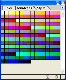
In practice, this is only somewhat useful information for artwork and photos. If you are using gradations of color, people who are viewing with few colors will see a dithered version of your artwork.
To the right is a 32-color version of my color wheel. You can see how the 32 colors are dithered with this dot pattern to form likenesses of the in-between colors.
So really, the worst thing that can happen to you if you design for the web using millions of colors, is that people who are not set up to view your colors will see dithered versions. Big deal? Probably not.
However, if you are choosing a color for your site's background, and you want that same color for the background of your site's interface, for example, it might serve you to use a websafe color for this.
|
 |
|
b. Finding Web-Safe Colors.
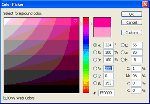
Photoshop gives you an easy way to find web-safe colors -- ticking the Only Web Colors box in the Color Picker.
|
 |
2. Printing Gamut Concerns
When printing, a whole new concern becomes apparent. In case you have not noticed yet, things do not always appear the same on your monitor as they do when they come from your printer.
Though some of this may be due to calibration problems, it is likely that this is because you are trying to print colors that are "out-of-gamut."
Whilst your monitor creates colors by mixing red, green, and blue light (RGB), your printer creates color by using light-absorbing inks of cyan, magenta, yellow, and black (CMYK). These pigments are much more limited in their ability to display color than your monitor. Therefore, what you see on your monitor is often NOT what you get in print.
|

Oranges are bright and clear.
|
| a. Soft-proofing.
If you want to know what an image will look like in print, you can "soft proof" it, by looking at a CMYK preview. To do this, use View > Proof Colors or Ctrl-Y.
Use the same command to get out of the soft-proof view.
The soft proof is what the image should look like (provided your printer and monitor are calibrated correctly).
|

Oranges are a bit muted.
|
| b. Gamut Warning View.
If you want to see which particular colors are out-of-gamut, you can do this using Shift-Ctrl-Y or View > Gamut Warning. This grayed out view (see right) is not what will show when you print, but this shows you which of your colors will be "dumbed down" for printing.
Digression: In this view, you can do a color correction, if you want, and this will bring these colors back into view. Once they are visible, they will be printable as you see them!
Use the same command to get out of Gamut Warning view.
|
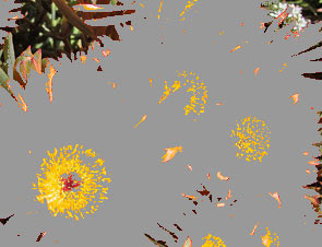
Grays show colors from the image that are out-of-gamut.
|
| c. Telling if a color is out-of-gamut or websafe.
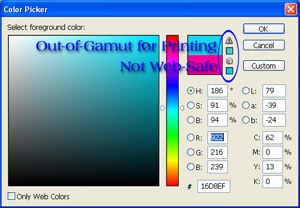
What if you need to know about a particular color? How can you find out if it is websafe or printable?
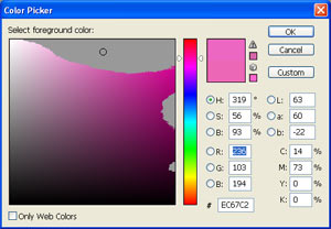
You can find it on your color-picker and look for the websafe or out-of-gamut warnings. The top triangle warning tells us that this turquoise I've chosen is out-of-gamut for printing. The bottom cube tells us that it is not a web-safe color. The little squares show you the nearest color which is either printable or web-safe.
|
 |
|
d. Picking a color that is in-gamut.
Just as you can tick the Only Web Colors box to see the palette of websafe colors, you can also see a palette of printer-safe colors.
With your Color Picker open, use Ctrl-Shift-Y to see which of the colors will be printable in the selected range.
Use the same command to get your pretty Color Picker back with all its range of colors!
Now, do something! Choose your favorite color of the moment in the Color Picker. Use the Gamut Warning indicator symbol and the Web-Safe warning to see if your color is websafe and if it is printer-safe.
Now do a Ctrl-Shift-Y on your Color Picker. (Use Ctrl-Shift-Y again to get out of this view!)
|
 |
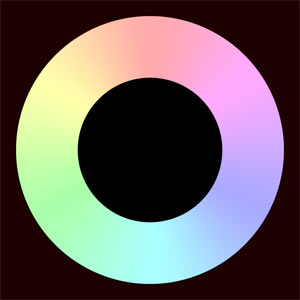
| e. Create a Color Wheel of your own, using fully saturated colors (#FF0000 red, #FFFF00 yellow, #00FF00 green, #00FFFF cyan, #0000FF blue, and #FF00FF magenta), or drag this one to the right over to your Photoshop desktop. Now "soft proof" the colors, as described above.
How does this color-proofed view of the image differ from the original view?
|
 |

Darker
|
Lighter
 |

Less Saturated
|
|
|
I hope you enjoyed this tutorial!

|
|