|
From: Iori Yagami
Sent: Friday, August 13, 2004 7:51 AM
To: janee
Subject: please help me with circular text
hi! When i see your logo at your site, i was wondering how to make a circular text. Can you help me with this please? Thank you very much ...
Iori
Hi there, Iori!
With Photoshop CS, it's pretty easy, because you can do type on a path. If you're working with an earlier version, though, it is a bit more involved. Here's how to do it:
- On a new layer, make a circle which your letters will follow. You can delete this later if you want.
- Drag out guidelines to mark the center of your circle.
- Choose your Type tool and type your first letter at the top of the circle.
- Duplicate this layer.
- Ctrl-T to bring up your transformation handles.
- Drag the center of transformation (the little dot in the middle of the transformation bounding box) to the center of the circle.
- Now you need to know how far to rotate the letter. Take the number of letters you want and divide this into 360. That will give you the number of degrees to type into the Transformation options bar under the angle to rotate.
- Hit Enter to complete the transformation.
- Now here's where the trick (and fun) comes in. Ctrl-Alt-
- Shift-T. Repeat.. repeat... till your circle is surrounded by this letter.
- Once you have letters all around the circle, you can go back to each type layer and edit it by typing in the correct letter for that space.
Really... this sounds more difficult and time-consuming than it is. I call this process "iterative transformation," and there is MUCH you can do with it. Iterative transformation is one of the topics I cover in my Photoshop Starting with a Blank Canvas class. You can read more about my classes at www.myjanee.com/classes.htm.
Sent: Tuesday, November 04, 2003 9:43 AM
Subject: photoshop for comics
From: david l
Hi Janee,
I know this is kind of an odd question and don't even know if you've ever looked at a comic book, but their is a process where you make black dots into a uniformed pattern, that when shrunken down look grayish. these patterns are standardly used in japanese comics but are done by hand(it was called zip-a-tone).what it is used for is adding shading in black & white illustrations but you can still photocopy them and not lose any of the dots or detail because it's all black. it can be done in photoshop because my one friend is in the business now and used to use it, sadly i can't contact him to find out. i have asked so many people and gotten the wrong anwsers
If cou could please end my torment i would appreciate it. thank you so much.
David L.
Hi there, David!
Quote:
what filter are you usin' in photoshop?
Depends on what you're talking about. I guess you mean the zipatone dots? There are several ways to do that. I use color halftone. I do the same for the color dots, but I work with them in channels selectively.
I hate to give out the secrets, but hey, that's how I got them.
_________________
Dean+
http://www.deantrippe.com
But the best link is this one http://www.howardcruse.com/howardsite/feature6/cartoonemail/ which has a full tutorial on this starting about 3/4 of the way down.
Hope this helps, David!
Always me, Janee
Hi, Janee,
I have 3 questions.
1. In Photoshop, if I have created an open path and then deselected the path, is there a way to subsequently join the two end points?
2. If you have drawn a closed path, is it then possible to remove one of the sections without the two remaining end points then joining?
3. After creating a path, is it possible to flip it horizontally or vertically?
Very truly yours,
Musawwir
Hi there, Musawwir!
Because these are not operations I do often, I had to actually remind myself exactly how this works. The answers to each of your questions is YES! Let’s look at them individually:
1. If you have created an open path and deselected it, you can pick it up again:
- In the toolbox, choose the Direct Selection (white) arrow.
- Click somewhere on the path to re-activate it.
- Click the point where you want the path to continue and you are back in business.
- Finish your path from there.
Note: You don’t even have to click that same point. You can click the other end, any other place on the path.. or anywhere on the canvas, for that matter!
2. You can indeed remove segments from a path without affecting the rest of the path:
- Choose the white arrow.
- Click the segment you want to remove.
- Hit the Delete key.
3. Yes, you can flip a path horizontally or vertically, but Photoshop adds an extra step for us:
- Choose the black arrow, the Path Selection tool.
- Click the path to select it.
- Go to Edit > Transform… and you see that the flip options are unavailable. So, instead, click Free Transform Path. But don’t do anything to it!
- With the transformation box active, go BACK to Edit > Transform… The flip options will now be available to you!
Thank you for giving me a reason to muck around with these path questions!
From Alt.Graphics.Photoshop
Subject: Re: Text on path question...
I've never really had the need to do this but, now I'd like to know how I would create type to flow along a path? Specifically, I need text to surround a perfect circle.
Would appreciate any help.
Thanks.
--Vector
Hi there, Vector!
Sure, it will be cool when PS8 offers us a way to do this easily, but for now... there is a way that isn't all that hard and is actually kind of fun. Working through these steps should also give have you scratching your head as you think of more things to do with this. Here we go:
1. Choose your font and your color. Drag guidelines out to the center of your canvas. (Or use your trusty action. I have a tut for making such an action here. The crossing of your two lines will be the center of the circle.
2. Type ONE letter at the top of the circle.
3. Drag this type layer down to the New Layer icon to duplicate it.
4. Ctrl-T to bring up the Transformation handles. Drag the CENTER point of the transform box to the crossing of your guidelines. Either rotate by dragging, or type in an angle of rotation in the box in the options. (If you know how many letters you want, divide the number into 360 to get the angle of rotation you need.) Hit Enter to complete this transformation.
5. Now.. this part is cool. Ctrl-Alt-Shift-T. Repeat till you have enough letters to do your text. Of course.. these are all the same letter, but you fix that in the next step.
6. Go to each of these type layers and edit the type so that it has the letter you want.
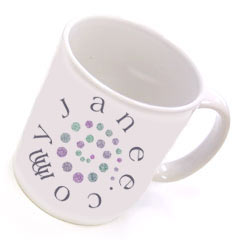
This is the technique that I used in the myJanee.com logo above.
Always me, Janee
Sent: Tuesday, June 03, 2003 10:36 AM
To: janee@myjanee.com
Subject: Any advice on this?
Hey Janee,
That page curl effect is really cool! Definitely going to try that one out too! I think I have tried my hand at most of your tutorials LOL, gee they are really great! Thanks for putting that site up, you have no idea how helpful its been, especially the one about the Duotone trick leaving some things colored? GeeeZ what an easier way to go about it! THANKS!!!
Here's a dilemma I am in, I want to know how to do a PORCELAIN effect. (picture was attached) I have tried for 3 months to achieve this effect.
Any ideas? Would love a tutorial on this LOL!
This technique has truly made me insane! I can't get it no matter what I try. I think it's beautiful and would love to accomplish this for my clients :(
Any ideas on how its done? Any help you could give would be MORE than appreciated.
Thanks so much!
DeAnn
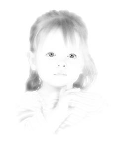 Hi there, DeAnn! Hi there, DeAnn!
I just love a challenge! I had seen someone asking in the Usenet group how to do this effect and the answer was something snippy like "You have to shoot it that way in the studio, doofus!" Well... since I don't HAVE a studio, but am a fair hand with Photoshop, I decided just now to try this. Here's my result. Of course the subject has a few years on these cute kiddies in the site you cite, but I think I pulled it off pretty well.
Here's what I did:
1. Make a layer of white, and put it under the photo layer.
2. With the photo layer chosen, create a Layer Mask.
3. Paint black on this mask with a soft brush to mask out the backgound, not being too picky about stray hairs. They won't show anyway.
4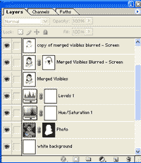 . Use a Levels Adjustment layer to up the contrast. . Use a Levels Adjustment layer to up the contrast.
5. Use a Hue/Saturation Adjustment layer to desaturate.
6. Make a new layer above all these. Ctrl-Alt-Shift-E to merge Everything visible into a new Merged Visibles layer.
7. Duplicate this layer.
8. Select the important features of the subject. For mine, I chose eyes, nostrils, mouth. Hold the shift key to add to the selection.
9. Select > Inverse.
10. Filter > Blur > Gaussian Blur. I used a setting of about 10. Your settings may vary. Batteries not included. The goal is to not have the person be recognizable at all, except for the selected out features.
11. Now... put this layer into Screen blending mode. You can duplicate this, to see if you like the effect better.
12. If you need to, put a layer mask on this screened layer and paint some black around any edges that are too fuzzy.
Always me, Janee
Sent: Friday, May 30, 2003 4:53 AM
To: janee@myjanee.com
Subject: What is Creativity?
The Question is.. " What is Creativity? "...
Would you agree with any of these?
- Using of graphic tools is creativity.
- Graphic tools part of creativity.
- Creativity is far from these tools.
Well I wanna know where creativity comes from and how it is related to Photoshop.
Looking forward to your response,
--Tahir A.
Greetings, Tahir!
What is creativity? I would expect that whole books are written on this topic, but I have not yet written mine.
As it relates to Photoshop and other tools of computer graphics, I would say this: These tools can help you to explore your creativity, but just using them doesn't make you creative. Creativity comes from within you. Creativity comes from closely observing your world and seeing its patterns and nuances which you can interpret on a canvas (digital or otherwise).
There are those people who say that anyone with Photoshop can be an artist, suggesting that just owning the program will somehow convert the average person into a creative genius. This just isn't so, and is an affront to the people who spend hours each day honing their skills and training their own creative instincts. There are people who never do learn to look around. They spend their days going through the motions, but never really have a look around.
And there are people who do look around, who can hear the music of the breezes, who smell the salt sea air, who exclaim at the beauty of the undulating lines of the ocean, but they are limited to drawing with a stick in the sand or to the canvas of their minds. Are these people any less creative because they lack the tools?
But it is the people who have both the tools AND the fire of creativity who are the richest! Digital tools are wonderful for people like me. I have not yet garnered the courage to experiment with "real" canvas, oils, chalk, or pen, but yet I can pick up my digital pen and make wonderful creations with the light of my computer. If I don't like what I've done, I can clear my canvas and begin again.
And digital tools, like Photoshop, can also help to spark the creativity, when we don't feel it. In Photoshop, we can quickly see the results of a photo manipulation. We can experiment quickly and easily. Sometimes I'll get an inspiration just from putting some lines on a canvas. I know that people can get inspired this way, without use of a computer, but the computer makes it trivial to try something!
So does creativity begin with Photoshop? No. Does Photoshop help a person to be creative? Yes! Can Photoshop create good art by itself? No. But can Photoshop help us to find the artist within ourselves? Yes!
Always me, Janee
|
 How I became the "Graphics Goddess"
 Hi there, DeAnn!
 . Use a Levels Adjustment layer to up the contrast.
 myJanee.commerce