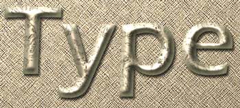
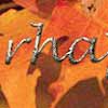
Antique
Gold Text
Antique
Gold Text
This effect lends a definite tone of aristocracy. Though I would not term this a "beginner tutorial," if you like the look, go for it! There are several steps, but I wrote this with you in mind, so you can do it. You will just have to be patient with yourself and go slowly. Glance through the whole tutorial before you begin, so you can get an idea where this is going. This will help it to make sense.
As you work through this project, you will learn/practice these techniques:
- Use several different filters to make a texture.
- Use alpha channels and lighting effects to create a 3-D look.
- Use layer effects.
|

Throughout this tutorial, if there is something in this color, underlined, there is a more detailed explanation of it available if you click it.
Use your "Back" button to return here.
This tutorial was written with Photoshop 7.
|
|
1. First, we will make the antique gold texture layer.
a. File -> New. Make it in RGB Mode.
Click the new layer icon in the layers palette to make a new layer.
Click on the foreground color swatch in the toolbar and choose a medium tan color. I like BEAD90 for this. Type this in under # in your Color Picker dialog box.
Then make black your background color.
Alt-backspace to fill your new layer with the tan.
(Note: For a plain shiny gold letter, without the antiquing, go straight to step 2 from here.)
|
I would like to stress here that there is an infinite number of ways to come up with a cool texture for this effect. If yours doesn't look just like mine, don't get hung up on that! You can still come up with a very cool looking antique gold!
I have given some of my settings here, but PLEASE experiment with them and don't feel that you are doing the "best" thing by using my numbers!
|
|
b. Click Filter -> noise and choose about 100, monochromatic.
|
 |
|
c. With Use Filter -> Sketch -> Reticulation (I used 0, 50, 0 for my settings.).
(At this point, adding in Filter -> Artistic -> Poster Edges creates a neat effect too!)
|
 |
|
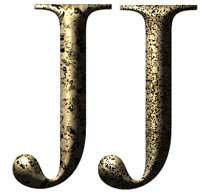
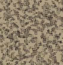
d. Filter -> Distort -> Glass (I used 18 and 11, frosted.). Your result should be something like mine at the right.
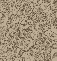
I like the effect where there are some areas that are just tan, and some little steaks of the dark brown running through it. A more even texture is ok too, but will lead to a bit different result, like this example
|
|
|
The JJ here gives a comparison of the result of using a varied texture and the more even one.
File -> Save As and pick a name. Leave your file in PSD format.
|
|
|
|
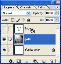
a. In the toolbox, choose the Type tool. When you click it on the canvas, it will make a new layer. Color doesn't matter and don't worry about font and size and stuff just yet.
- Type your text.
- Click the Type layer in the Layers palette to commit the text.
- Now you can fiddle with the options.
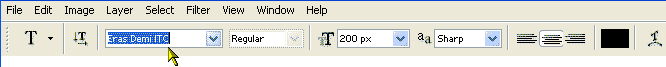
- Click the NAME of the font in the Options bar at the top.
- Now use the up and down arrows on your keyboard to preview your text in your fonts. The best fonts for this effect do not have very thin lines, as these will not show.
- You can adjust the size in the same way. If you want a size that isn't in the dropdown, you can type in the number in the blank.
- Move your text to where you think you will want it, in relation to your background, if this is a factor.
- Then click the visibility eye for that type layer to make it invisible!
2. Now let's type something. |
|
|
|
| b. We are just about to leave the Layers palette to make channels, but before we go, Ctrl-click that Type layer to load it as a selection. (It doesn't matter that it is invisible. ;)) |
 |
|
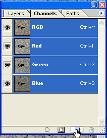
| 3. Next, make your alpha channels.
a. Click the Channels tab and then click the Create a New Channel icon at the bottom. This creates a new Alpha channel. You will now see your selection against a background of pure black.
Type D to make sure that your colors are the default white on black. Then Alt-backspace to fill the selection with white.
(What does Ctrl-backspace do?) (What's another way to fill this selection?) (Do you care? If you do, you can hit F1 in Photoshop to bring up the Help. Then click Index > F > Fill. Ok, so the help is somewhat lame, but it is good to know how to use it.)
Ctrl-D to deselect.
|
 |
|
Double-click the new Alpha channel and name it "Original."
b. Drag that channel label down to the new layer icon, creating a copy of it.
Double-click its name in the list and name it "Texture."
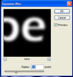
c. While you have your texture channel active, go to Filter > Blur > Gaussian Blur. Blur it enough that you can still see some white, but make it pretty blurry. I chose a setting of 5.8. Your mileage will vary based upon conditions, like the size and resolution of your image.
|
|
| d. Trim your Texture Channel as follows: Ctrl-click on the ORIGINAL channel to load it as a selection. Then with the Texture channel selected in the channels palette, Select > Inverse > and hit the Delete key. (Or Ctrl-Shift-i ... Delete.)
This clears away the excess fuzz around the outside of your blurred letter, leaving only a letter that looks rather like a fluorescent lightbulb.
Ctrl-D to deselect.
Ctrl-S to Save.
[Note: Strictly speaking, you don't NEED the Original Alpha channel for this, but you can reload the selection from the menu (Select > Reselect) or from the Layers palette again. However, I wanted to show you here that you can have and use more than one Alpha channel. The Original can also be used later, if you need that same selection again and have deleted the original type layer.]
|
 |
|
| 4. Bring your textured letter up through the gold you made as follows:
a. Now for the really cool part. Click the Layers tab and then select the layer with your gold that you made. This should be on a new layer, not the background.
(Note: If you mistakenly put the gold on the background layer, double-click it in the palette and that will make it into a regular layer so that you can do this next part.)
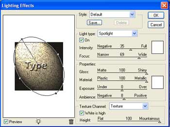
b. Click Filter > Render > Lighting Effects. In that dialog box, choose your Texture channel in the dropdown box toward the bottom where it says Texture channel.
It is important that you choose the "texture" one. If you choose your "original" alpha channel, your letter will be flat.
|
You should see your letter there on the little screen! Shine the spotlight around till you like the effect.
(Experiment with all the different sliders, seeing what they do. Notice the effects that you get from increasing the ambient lighting and from making the gloss shiny or matte, the material metal or plastic. Look at the bottom of that dialog box and move that slider back and forth for mountainous/ flat.)
|
c. Once you come up with an effect that you like, hit OK.
Ctrl-S to Save.
|
|
5. Now trim and finish the letter:
a. Trim the excess gold from around the text. You do this just as you trimmed the extra blurring in the texture channel:
- Ctrl-click the Type layer there in the Layers palette to load it as a selection.
- Click on the gold layer.
- Ctrl-Shift-i ... Delete!
Ctrl-S to Save.
|
|
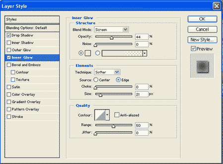
b. Now to pretty it up, you can add a background or a Layer Style. I like using an Inner Glow of the default light yellow, but then sizing it up so that it nearly covers the letter and then reduce the opacity. A drop-shadow does a lot to give the feeling of depth, too. Try all the different choices and some different bevels to see what they all do to it.
|
|
Your letter is still on just a WHITE background at this point. To get this golden wheat thatch paper i've used, keep going! :)
|
 |
|
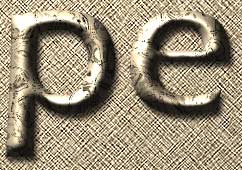
c. Do a gradient background if you like. For my W example, I did a gradient of BEAD90 gold -> brown. Then i added a medium amount of noise and then did Filter > Brushstrokes > Crosshatch.
|
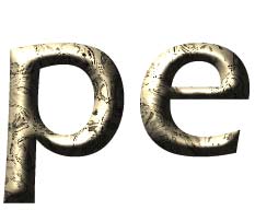
(You can also do just a plain BEAD90 background, noise, crosshatch and then follow with Filter -> Render -> Lighting Effects as you did above. This time, though, for Texture Channel, use None. This is what i did for my pe just above.)
Ctrl-S to Save.
If you want to save a COPY as a jpg, do just that. File > Save As... or File -> Save for Web. Keep your .psd file intact.
I hope you enjoyed this tutorial! :)

|
|
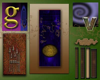
More Examples of this Antique Gold made by my students:

  
|